Rebranding a sustainable think-tank.

Sustainable Queenstown approach Matter* with the task of bringing a new visual identity to their organisation.
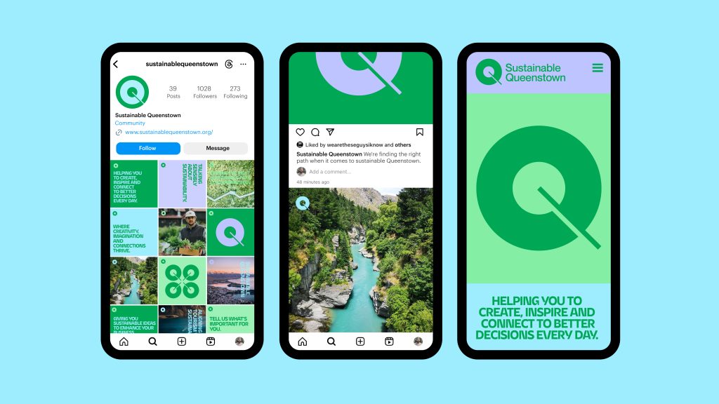
After an initial art direction phase we pushed into a more progressive look and feel. One that captured the vibrancy, energy and potential of the organisation, rather than falling into the corporate world of literality.
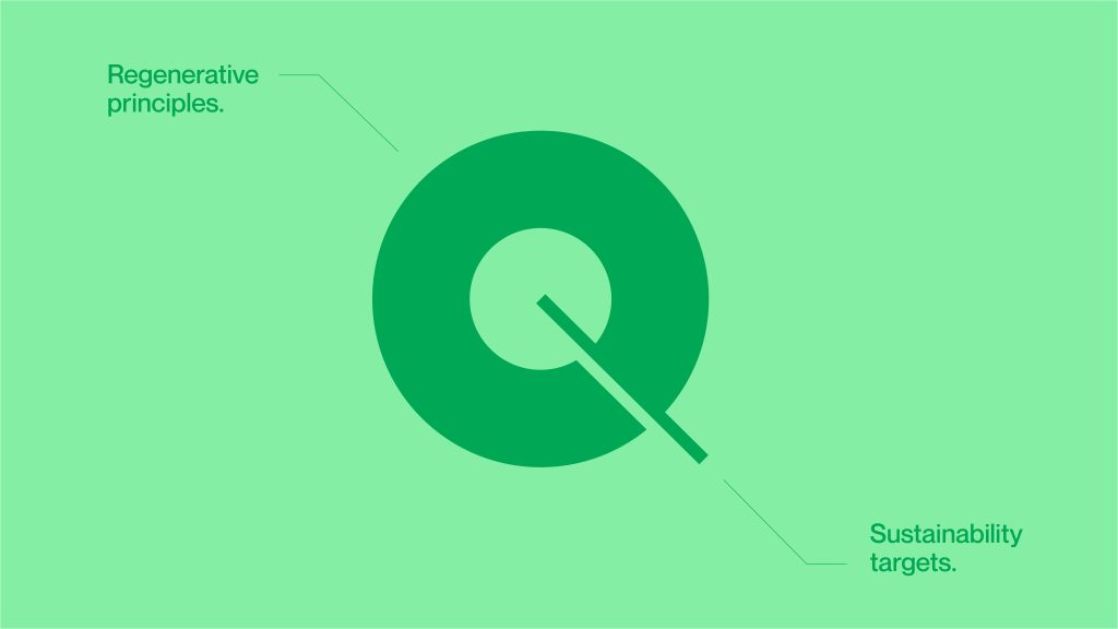
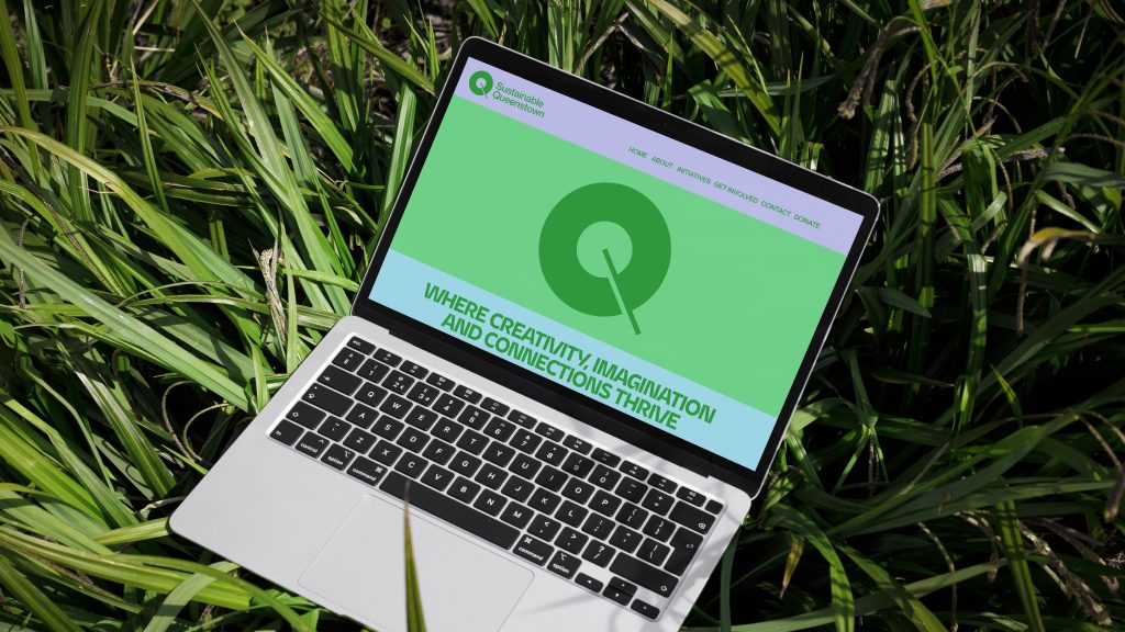
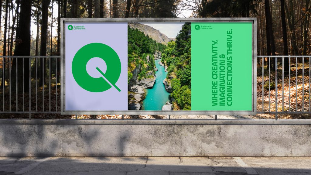
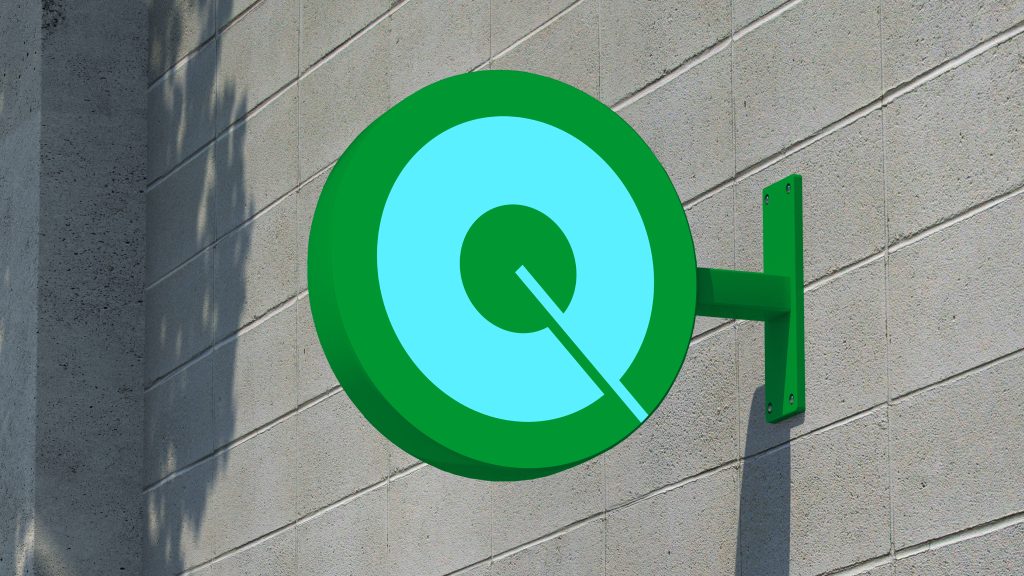
The Q symbol is simple, designed to represent circular and regenerative principles, the stroke becoming and input into that circular system and overall representing a target – something we strive for to make gains on your sustainability credentials.
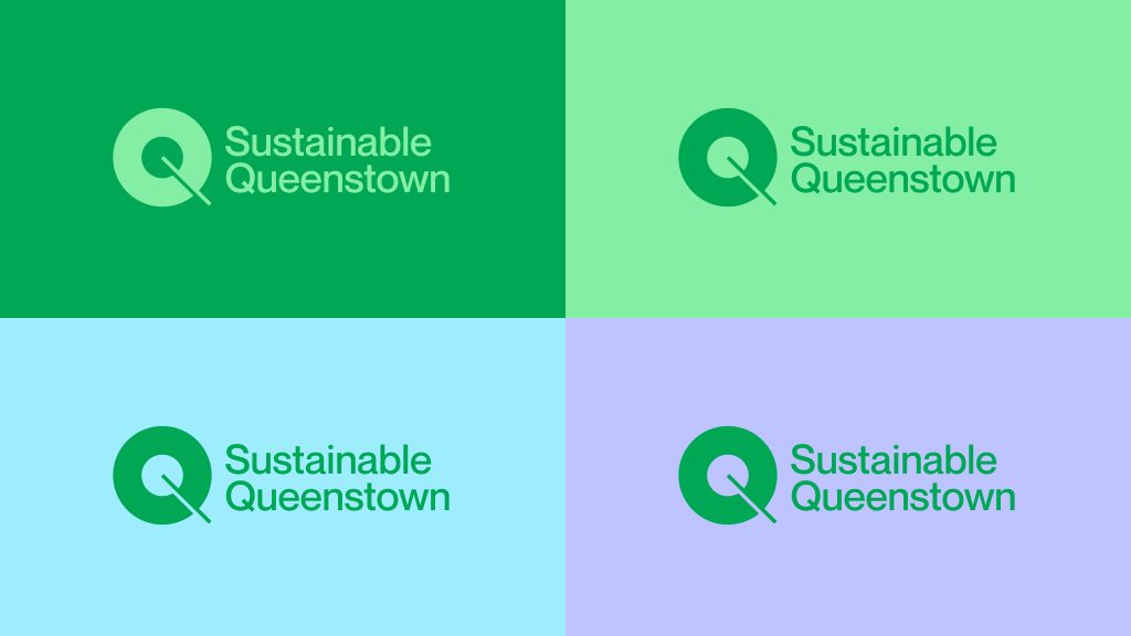
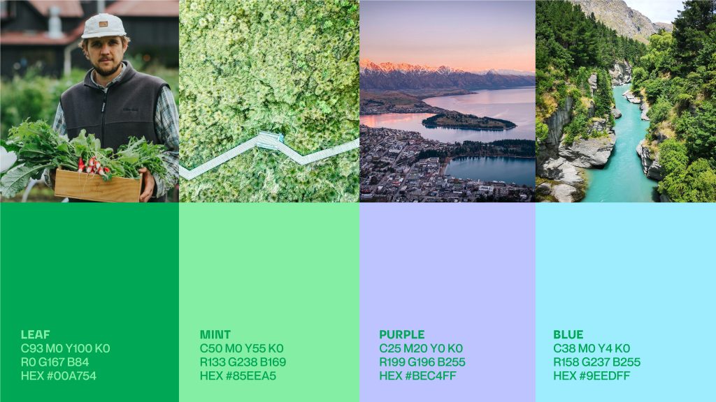
Colours are a huge part of the brand and being a digital first organisation, we could live in the RGB spectrum with electric, energetic and progressive hues inspired by nature. For example the electric and glacial blue of the local rivers define the region and the pastel purple hues at dusk and dawn light up the area.
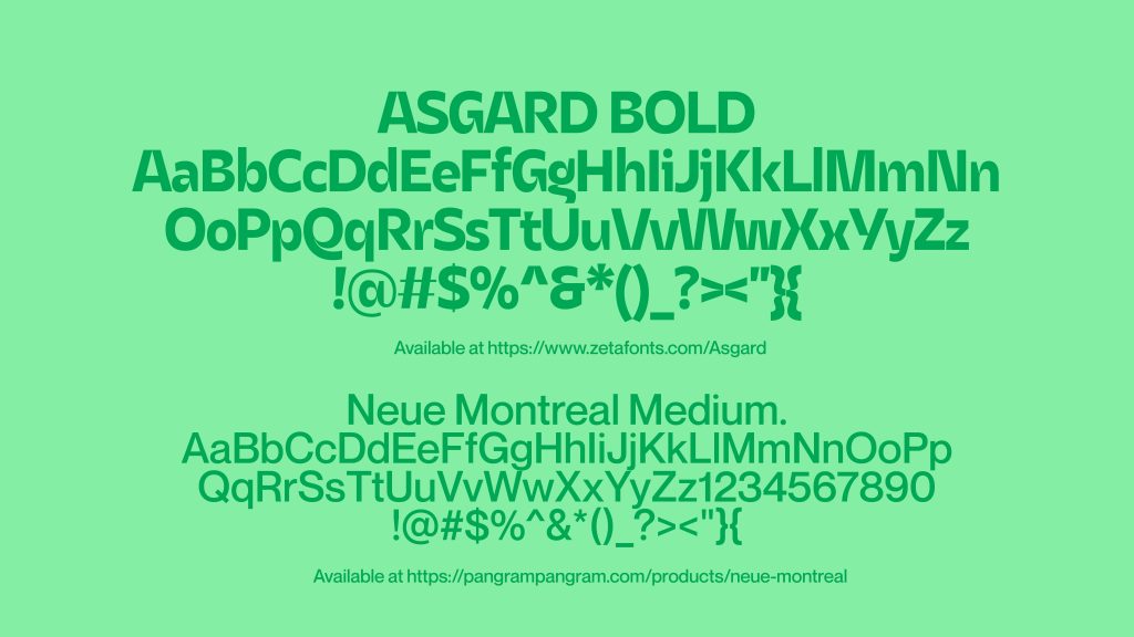
Typography again avoids corporate cues, with the modern, high-contrast sans serif Asgard Bold bringing energy and expressionism that matches the divine beauty of Queenstown. Matched with a simple Helvetica variant to bring sophistication and simplicity.
Agency: Matter*
Client: Sustainable Queenstown
Strategy: Brent Courtney and James Cummins
Design Director: Brent Courtney
Designer: Brent Courtney
