
Celebrating 30 years of loving tennis.


The Opportunity
For 30 years, the ASB Classic has been more than a tournament. It is a defining moment of the New Zealand summer. Long evenings, full stands, a drink in hand, the rhythm of play under lights.
ASB’s role is not just sponsorship, but hosting. They elevate the experience through lounges, viewing decks, and curated spaces where tennis meets hospitality. Where sport becomes entertainment.
This project set out to celebrate that full experience. Not just the match, but everything around it. The rituals, the atmosphere, the in-between moments.
The ambition was a visual language that felt timeless, not campaign-led. Considered, enduring, and able to live seamlessly across environments, merchandise, print, and digital.
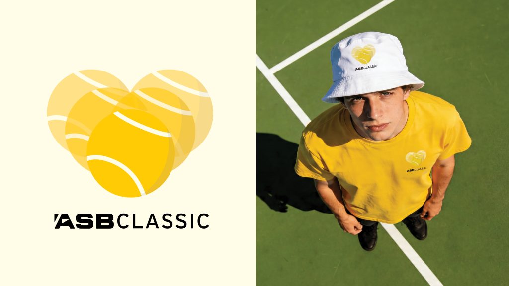
All anchored in a single idea: For the love of tennis.
The Idea
During the ASB Classic, tennis extends beyond the court into how people spend their time, where they sit, what they drink.
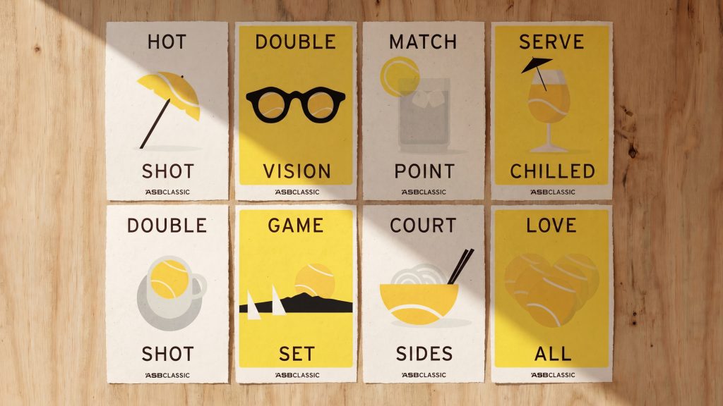
We captured that by letting tennis infiltrate everything.
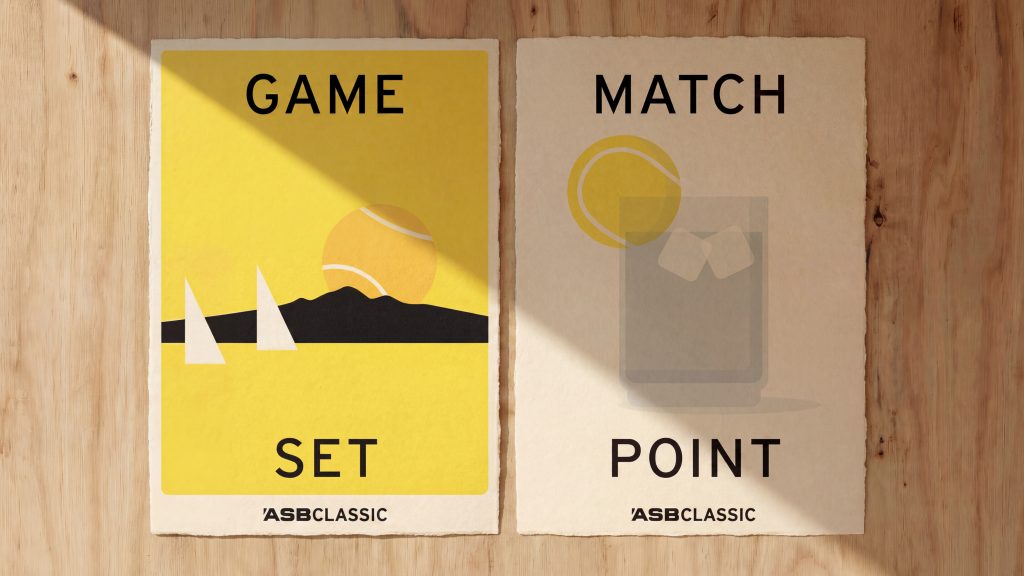
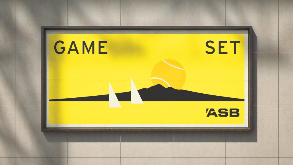
At the centre is a simple device. The tennis ball becomes the lens through which the experience is seen.
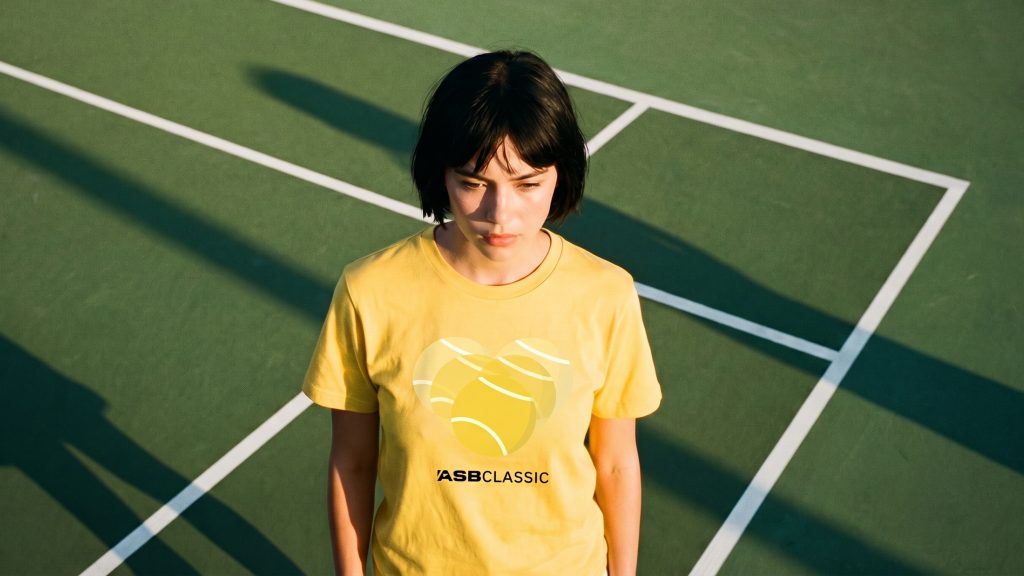
It becomes the sun over Auckland, the lemon in a drink, the scoop of ice cream, the detail in a bowl. Everyday objects are reinterpreted through tennis, creating visual plays that feel familiar yet unexpected.
Each carries a quiet wit. Not forced, but discovered. A system that rewards a second look.
Art Direction
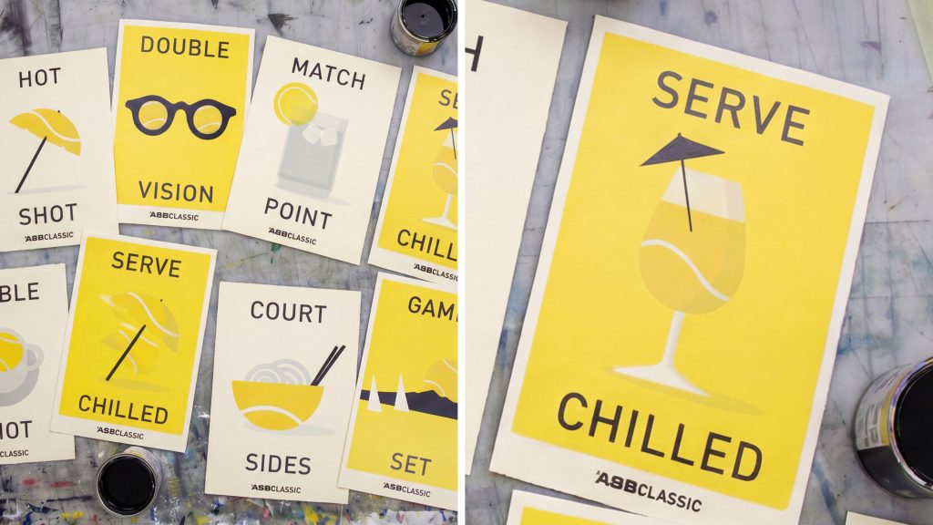
The art direction is deliberately classic and restrained. Inspired by traditional screenprinting, where ideas are reduced to their purest form.
Shapes are simplified. Colour is purposeful. Composition is balanced.
Flat planes and bold silhouettes are paired with subtle layering to introduce depth without complexity. Slight imperfections reference the tactility of print, adding a human quality.
The palette is anchored in tennis ball yellow and ASB’s brand colour, paired with black and warm neutrals. The result is confident, premium, and enduring.
Illustration System
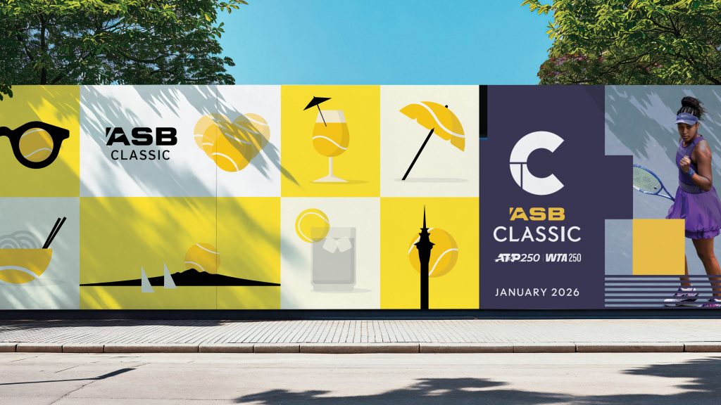
The illustrations work as a cohesive set. Each stands alone, but together they build a broader narrative of the ASB Classic.
The tennis ball is always present, but never repeated. It shifts between literal and abstract, adapting to context.
Objects are reduced to their essence so the idea leads. This creates a system that is both recognisable and highly flexible, moving easily between high-energy play and relaxed social moments.
Application
The system extends across the full ASB Classic experience.
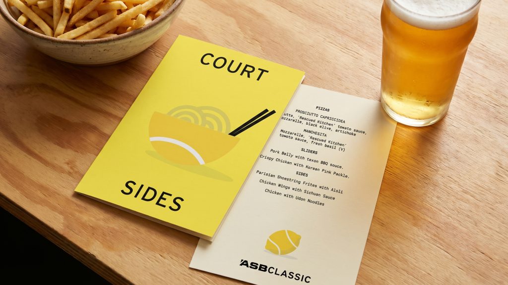
In-stadium, the design system creates bold, legible moments across hoardings and wayfinding. Within hospitality spaces, it reinforces the premium, curated environment of lounges and viewing areas. Across food and beverage, it embeds into menus and service moments.
Digitally, the system remains consistent, ensuring a unified experience at every interaction.
Classic in execution. Playful in idea. Premium in finish.
Brand Identity
Client – ASB Bank
Agency – Bastion Aotearoa
Design Director – Danny Carson
Business and Account Directors – Annabelle Pitken and Matt Nash
Art Direction, Copywriting, Design and Illustration – Brent Courtney