
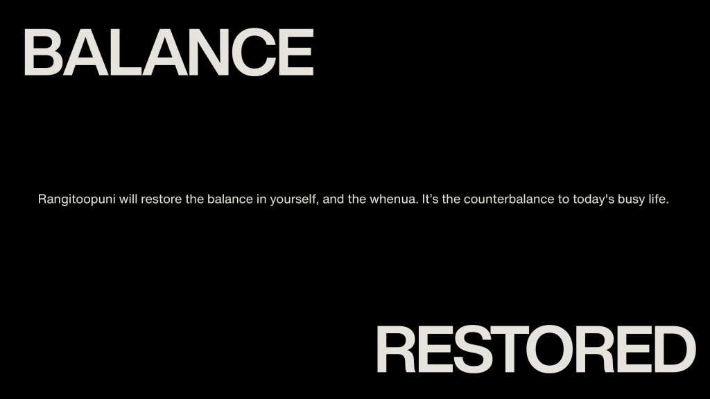
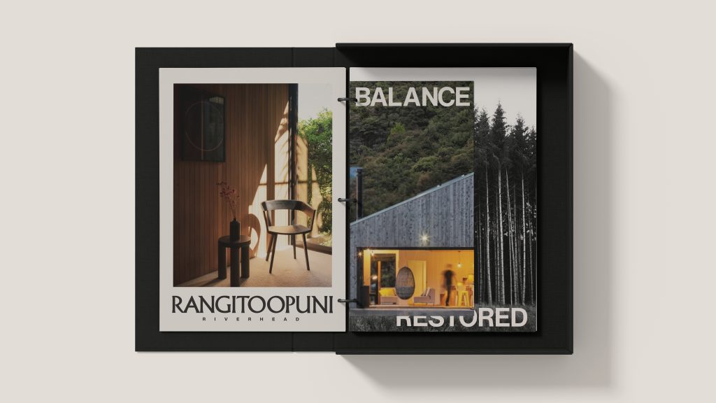
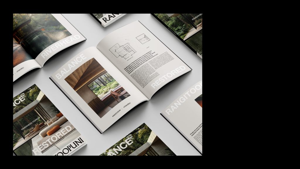
Balance Restored.
Strategy
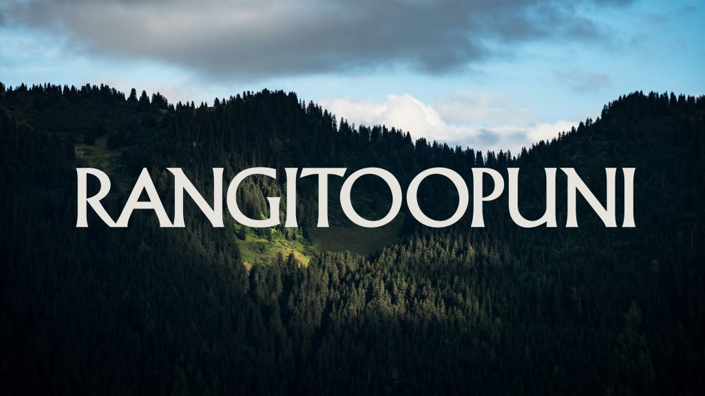
Rangitoopuni is not a land release. It is a return.
Gifted back to Te Kawerau ā Maki through Treaty settlement, the land carries a responsibility beyond development. It must be restored. What stands today as a mono-culture pine forest is not its natural state. Over time, Rangitoopuni will be returned to native ngahere, reintroducing biodiversity, reinstating the mauri of the whenua, and rebalancing what has been lost.
That idea extends beyond ecology. It becomes human.
Rangitoopuni offers a counterbalance to modern life. Close to the city, yet fundamentally opposed to it. Large, one and two hectare sites provide not just space, but a different pace. A way of living that restores something quieter, more grounded, more real.
The idea is simple and enduring.
Balance, restored.
It speaks to the land, to its history, and to the people who choose to live within it.
Brand Line
Balance Restored.
Creative Platform
The communications system is built on a deliberate tension. Familiar phrases are used, but their meaning is inverted.
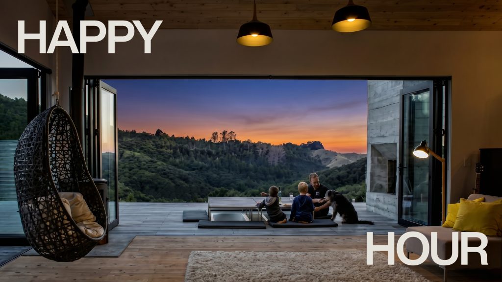
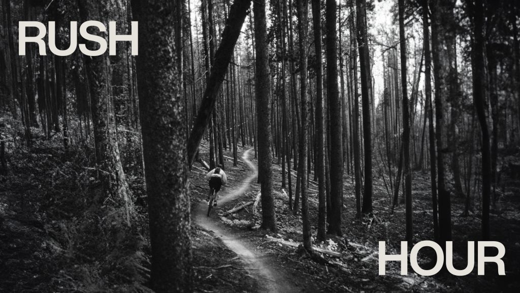
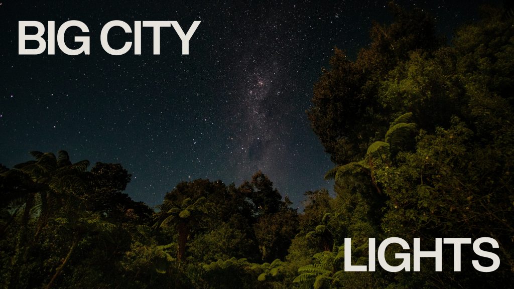
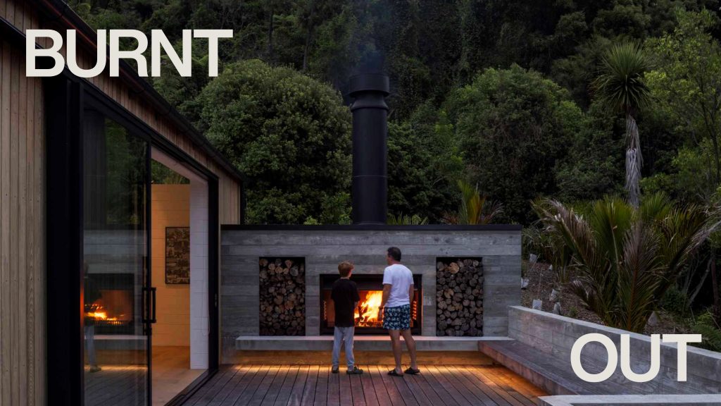
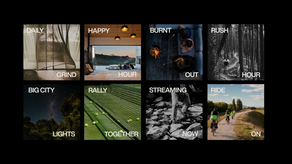
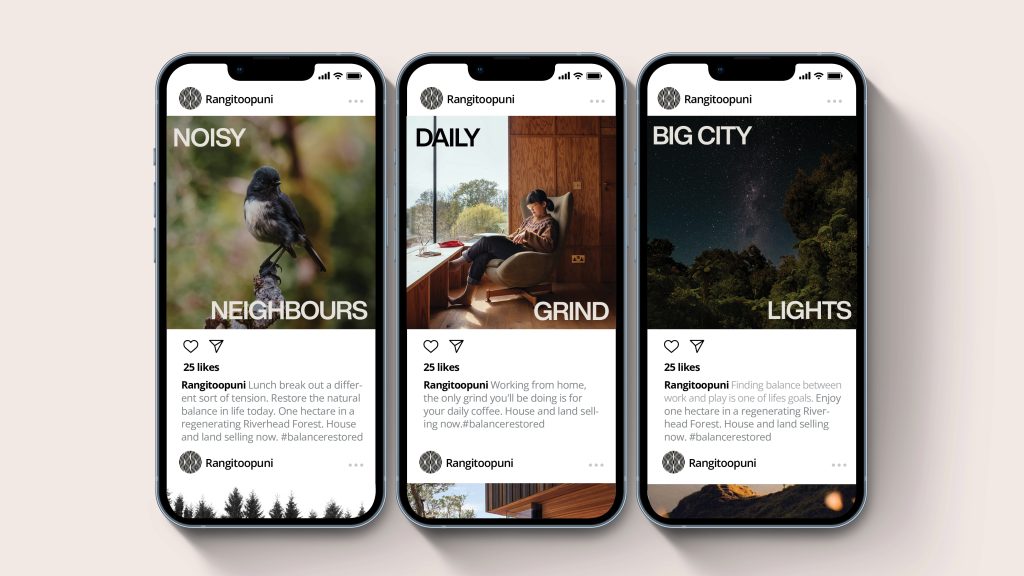
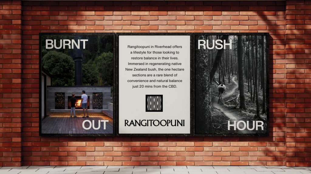
Rush hour is no longer traffic, but movement through forest trails. Happy hour is not a drink, but time with family. Burnt out is not exhaustion, but warmth beside an open fire. Big city lights are not neon, but stars above the canopy. Daily grind is not pressure, but quiet ritual.
Each line begins in the language of the city, then shifts into something more human. Recognition draws you in, but the reframing is what lands. It positions Rangitoopuni not as escape, but as a correction.
Design Case Study
The identity needed to hold cultural meaning, environmental ambition, and a premium positioning without excess. The solution is restrained, confident, and grounded in place.
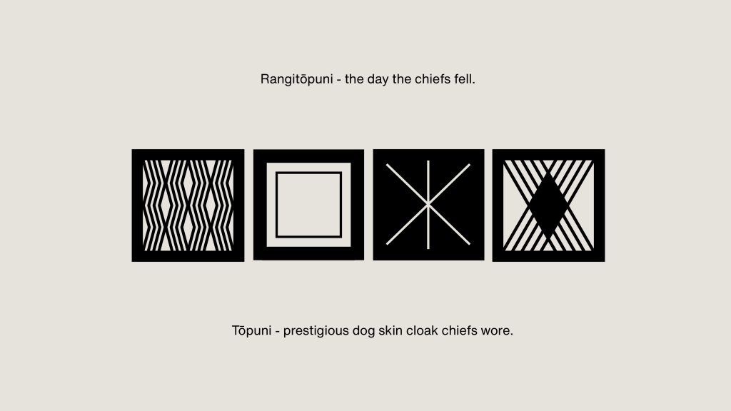
The name Rangitoopuni anchors the project in its history. “Topuni,” a prestigious dog-skin cloak worn by chiefs, became the key insight. From this, a series of tohu were developed, drawing from the structure and geometry of a laid cloak. Repetition, rhythm and layering inform the forms, creating a system rather than a single mark.
These symbols are not decorative. They carry cultural weight while functioning as a contemporary design language across all touchpoints.
Typography is bold and deliberate. Large-scale type delivers the message system with clarity and confidence, often sitting in tension against expansive natural imagery. The compositions are simple, allowing the land to lead and the message to resonate without distraction.
Photography avoids gloss. It focuses on light, stillness and human moments within landscape. The homes are present, but secondary. This is not about architecture dominating nature, but living within it.
Across social, outdoor and print, the system remains consistent. A grid of messages builds recognition over time. The brand becomes identifiable not just by how it looks, but by how it thinks.
Rangitoopuni does not compete in the language of development. It offers something rarer. A restoration of balance across land, life and self.
Brand Identity
Client – Te Kawerau ā Maki and Avant Group
Agency – Front Room
Creative Director, Copywriter, Designer – Brent Courtney