
Reintroducing a Rotorua icon with a new sense of romance.
After an extended period out of operation, the Lakeland Queen was preparing to return to Lake Rotorua under new ownership.
The paddle steamer already had strong local recognition, but the brand needed more than a simple refresh. It needed to signal that the Queen was back, reconnect with its history and establish a distinctive presence within Rotorua’s crowded visitor market.
The opportunity lay in what made the experience different. A paddle steamer is not simply another way to see the lake. It feels slower, more atmospheric and more romantic — a memorable journey that connects scenery, hospitality and local stories.
The strategic idea
Rather than position the Lakeland Queen as another contemporary tourism attraction, we looked backwards to move the brand forward.
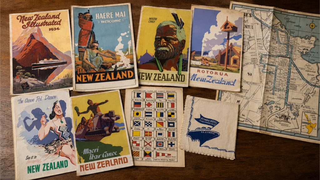
The creative direction drew inspiration from New Zealand tourism advertising of the 1930s through to the 1960s — an era of bold illustrated posters, expressive display typography, simplified colour palettes and an optimistic sense of discovery.
This visual language gave the brand an immediate point of difference. It celebrated the nostalgia of travelling by paddle steamer while still feeling fresh, ownable and relevant to today’s visitor.
The result is a brand that feels less like a standard tour operator and more like a rediscovered Rotorua icon.
Identity and visual language
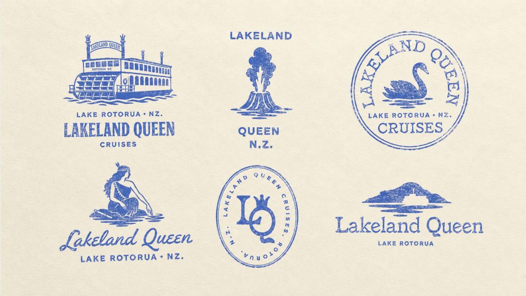
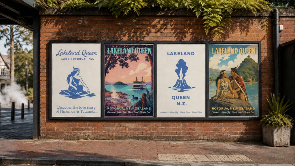
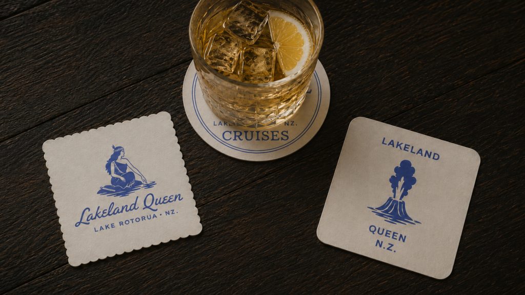
The identity combines a series of custom marks, typographic treatments and illustrated symbols inspired by the lake and the Queen’s surroundings.
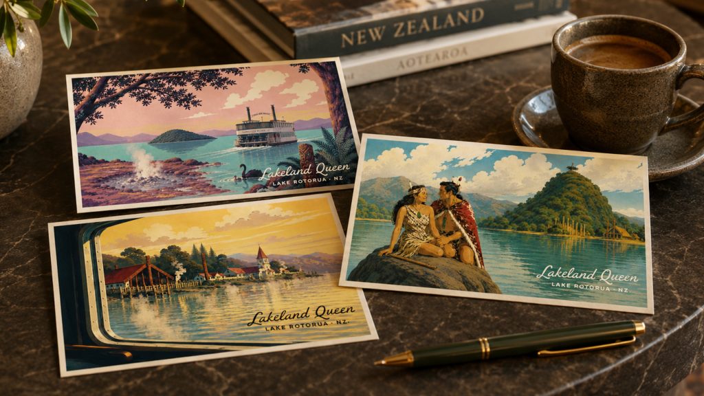
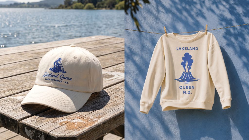
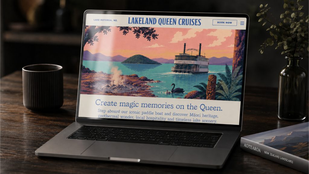
The paddle steamer, geothermal activity, black swan, Mokoia Island and Hinemoa and Tūtānekai story all became part of a flexible visual system. These elements could work individually as stamps, badges and merchandise graphics, or together within larger campaign compositions.
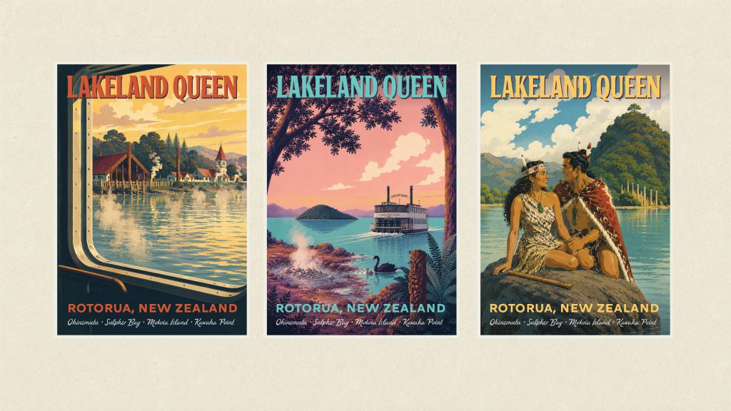
A restrained blue and cream palette created a timeless foundation, while the illustrated posters introduced richer combinations of turquoise, coral, ochre, deep navy and warm gold.
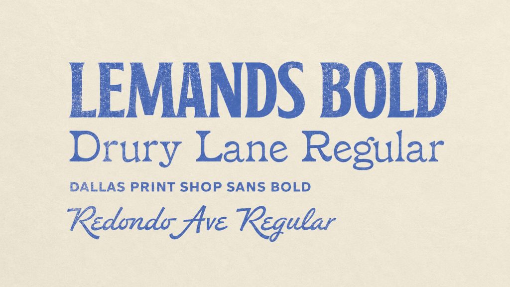
The typography also references historic travel graphics, pairing bold condensed display lettering with softer serif and script styles. Together, these elements create a visual world that feels collected over time rather than designed as a single corporate system.
The poster campaign
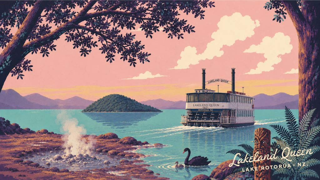
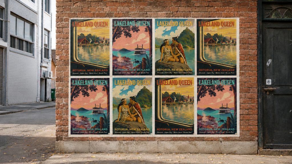
The hero campaign was built around a suite of retro-inspired tourism posters.
Each poster highlighted a different aspect of the Lakeland Queen experience: geothermal scenery, lake views, Māori stories, the romance of the paddle steamer and the distinctive Rotorua landscape.
The posters were designed to work individually and as a set, creating strong visual impact across outdoor advertising, local poster sites and social content. Installed together, they formed a colourful campaign wall that stood apart from the highly photographic and often interchangeable language of the wider tourism category.
The approach helped give the returning attraction a sense of history, confidence and permanence.
Extending the experience
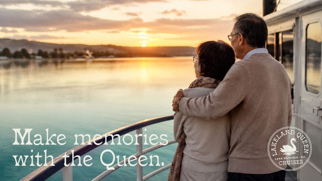
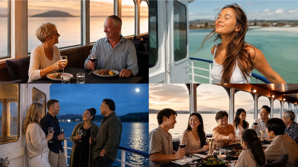
The visual identity was carried across the full customer journey, including the website, campaign photography, social media and promotional material.
It also created a natural platform for merchandise. Postcards, coasters, caps, sweatshirts and other keepsakes were treated as genuine tourism souvenirs rather than simply branded products.
This was an important part of the idea. Visitors could take home a small piece of the Lakeland Queen’s visual world, extending the memory of the experience beyond the cruise itself.
Creative production
The project was delivered within a modest production budget.
To achieve the scale and richness of the creative ambition, AI-assisted image-making was used as part of the illustration and photography process. This allowed us to develop a broad collection of retro-inspired campaign artwork, lifestyle imagery and mockups that would otherwise have required a significantly larger production budget.
The technology was used as a creative production tool, guided by a clear strategic direction, art direction and design system. Every image was refined to ensure the campaign remained consistent, distinctive and recognisably Lakeland Queen.
The result
The refreshed identity gives the Lakeland Queen a visual presence equal to the experience itself.
It reconnects the attraction with Rotorua’s tourism heritage while introducing a new sense of energy, warmth and romance. More importantly, it provides the new owners with a flexible brand system that can work across campaigns, digital platforms, merchandise and the onboard experience.
A familiar Rotorua attraction has been given a new lease of life — not by leaving its history behind, but by making that history the source of its future.
Brand Identity
Client – Lakeland Queen Cruises
Agency – AO Studios
Creative Director, Art Director, Designer – Brent Courtney