
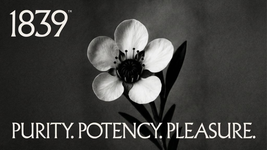
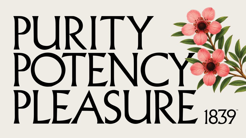
Purity, potency, pleasure.
1839 is built on origin, not invention.
In March 1839, Mary Ann Bumby introduced the first honeybees to New Zealand. A small act that reshaped an ecosystem. The brand takes its name from that moment, grounding everything in a story of arrival, cultivation and care.
This idea informs the design language. Old science meets new luxury. The visual world sits between botanical record and premium product, drawing from the tools, markings and materials of early beekeeping, then refining them into something precise and contemporary.
The identity is deliberately restrained. Serif capitals carry a sense of heritage and authority, while a monospaced, almost typewriter-like secondary font introduces a scientific clarity. Together, they create tension between romance and function, between archive and modernity.
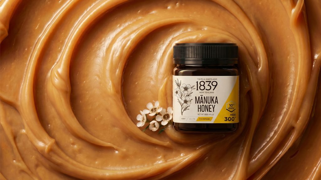
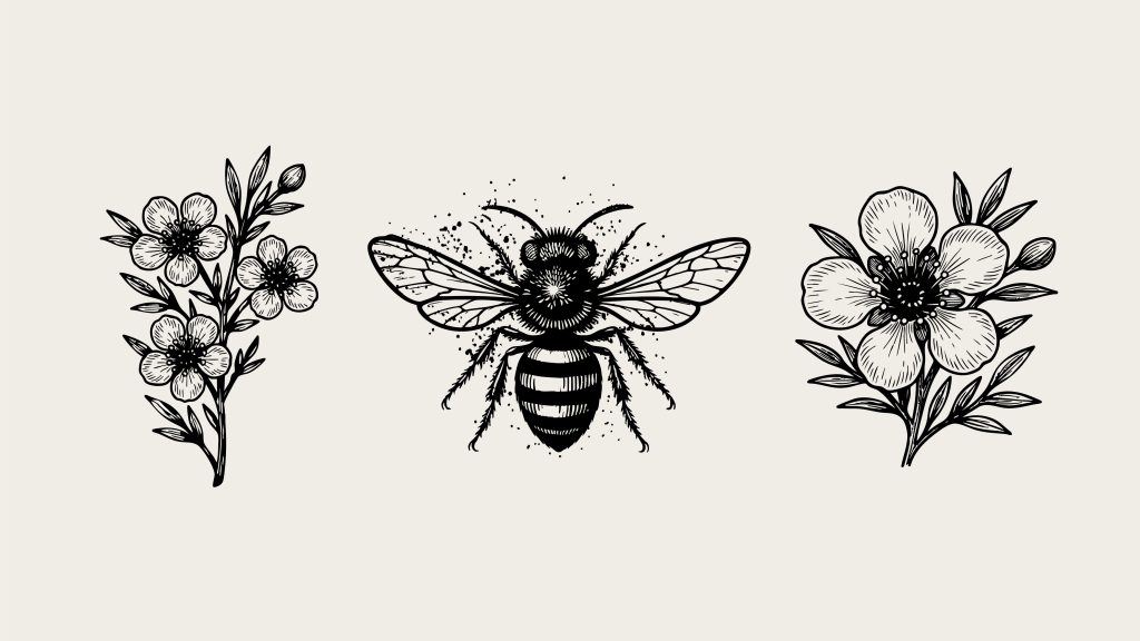
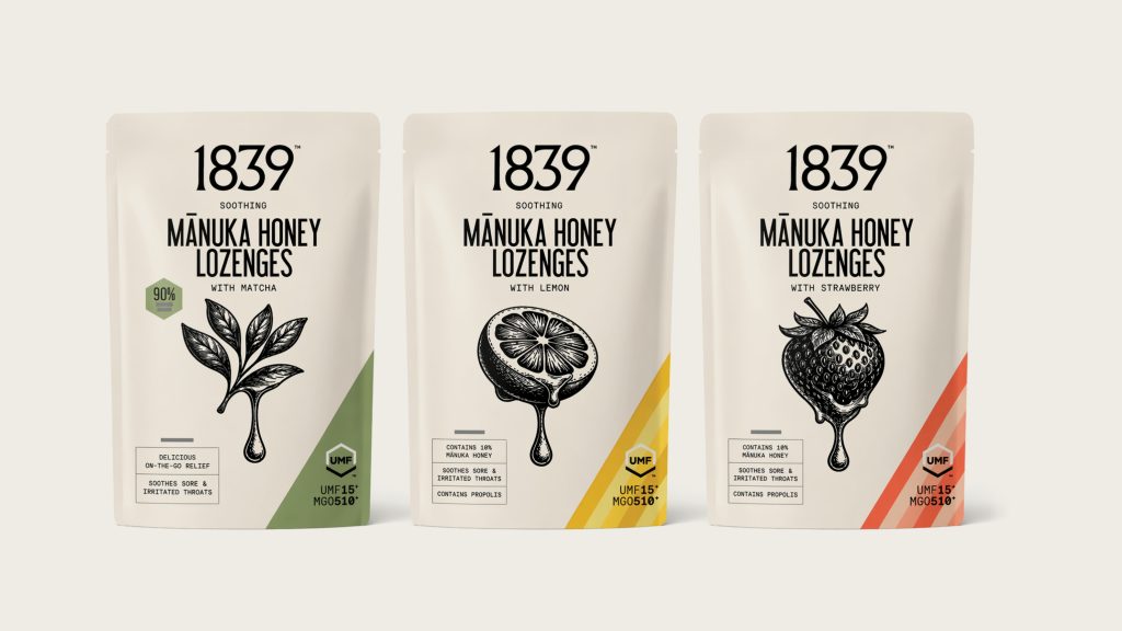
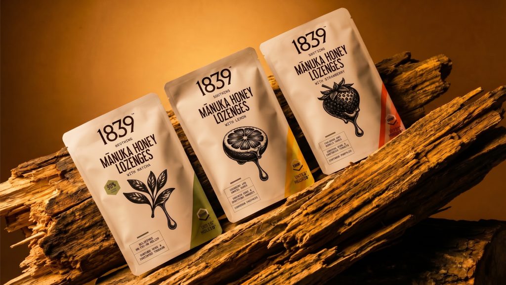
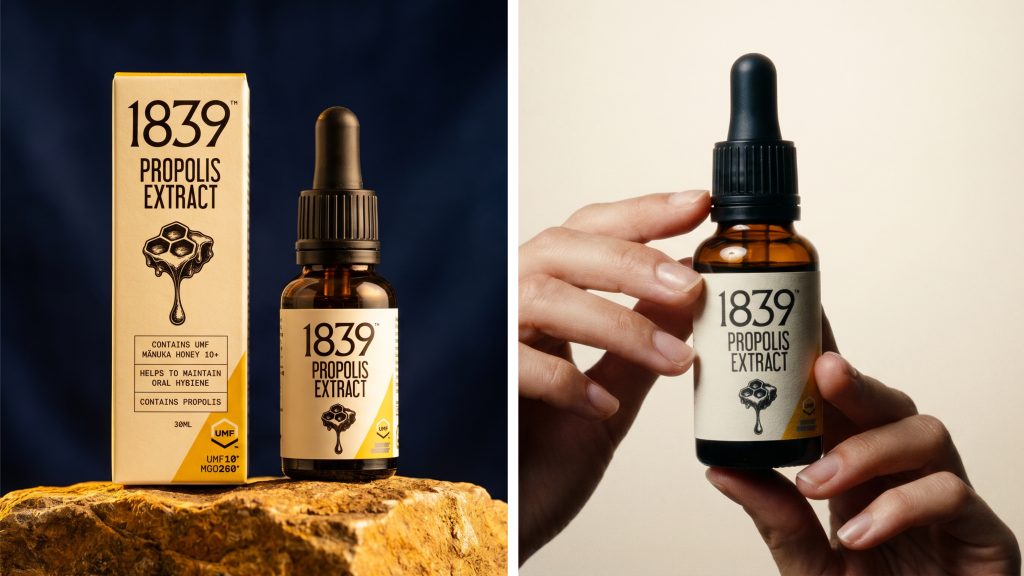
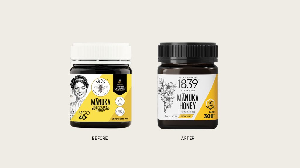
Illustration plays a central role. Black and white etched botanicals and bees reference the observational drawings of Bumby’s time. They are not decorative, but documentary. Each mark feels studied, collected, and preserved, reinforcing the idea that this is a product of nature, understood through craft.
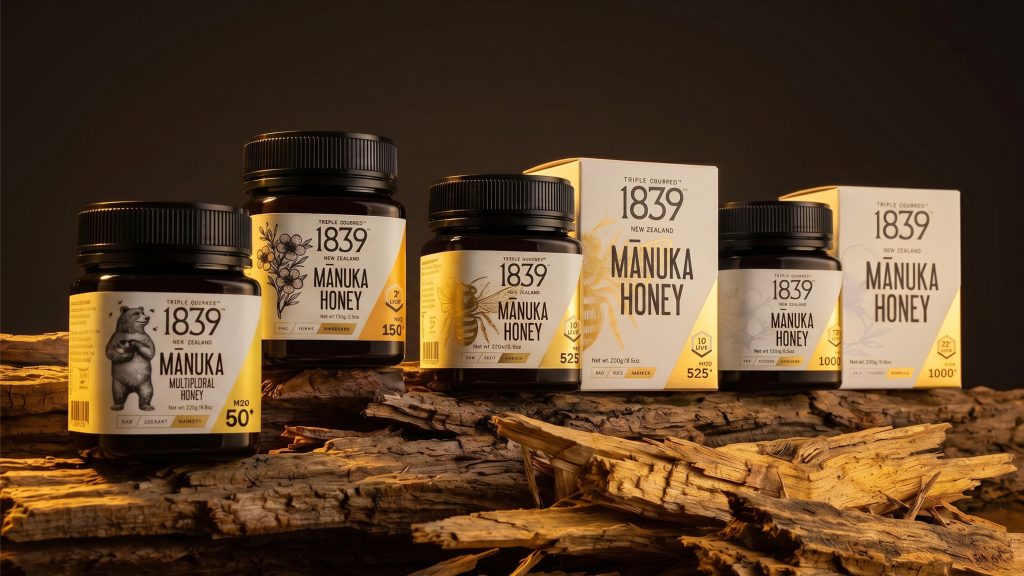
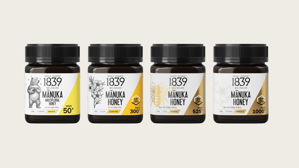
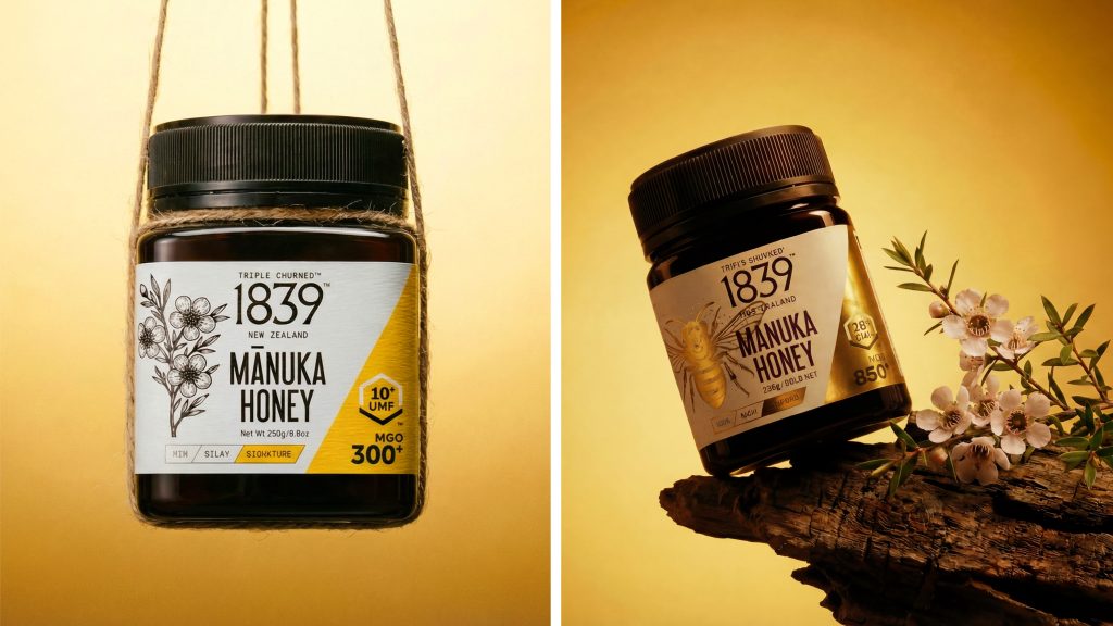
Colour follows the same logic. Soft creams and muted tones create a quiet, apothecary base, while golds and yellows introduce warmth and value. The diagonal slash becomes a defining device across the system. More than a graphic gesture, it signals progression. A visual shorthand for strength, quality and refinement across the range.
That range is structured clearly, moving from Harvest through Signature and Reserve, to Pinnacle. The hierarchy is no longer buried in detail. It is immediate, legible, and confidently expressed through scale, colour and composition.
This clarity extends to the pack itself. The shift from white lids and a more generic, mainstream presence to a darker, more considered form gives the product weight. The logo is no longer competing. It leads. Information is organised, not crowded. Every element has space to hold meaning.
Across jars, lozenges and extracts, the system remains consistent. Materials, tones and typography work together to create a unified world. One that feels collected rather than designed, premium without excess, and grounded in both history and intent.
Brand Identity
Client – 1839 Honey
Client – Graham Ricthie
Creative Director, Designer – Brent Courtney