
Bringing back the cowboy.

Lone Star restaurants undertook a full repositioning of their brand and marketing efforts, with the goal of reconnecting with their heritage while modernising the customer experience.
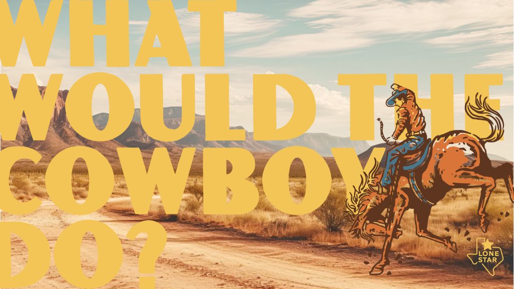
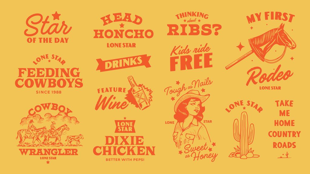
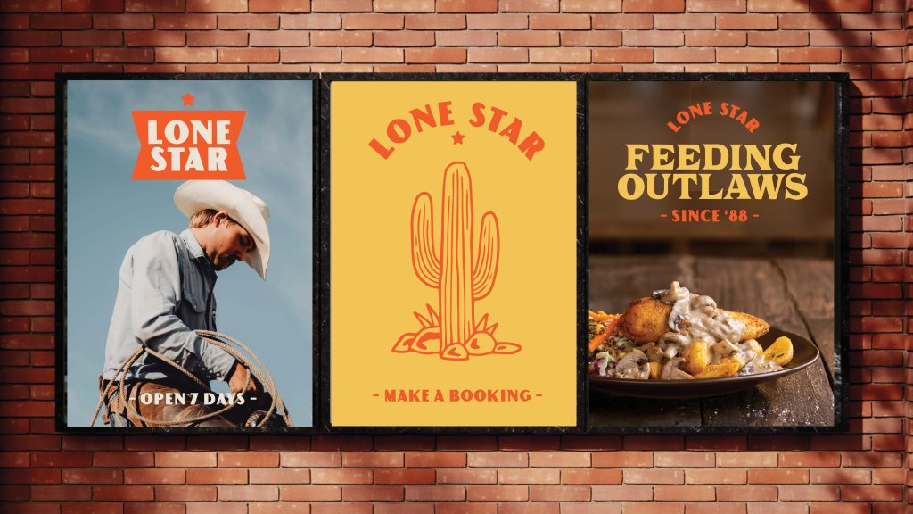
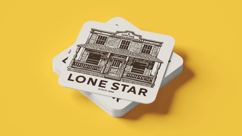
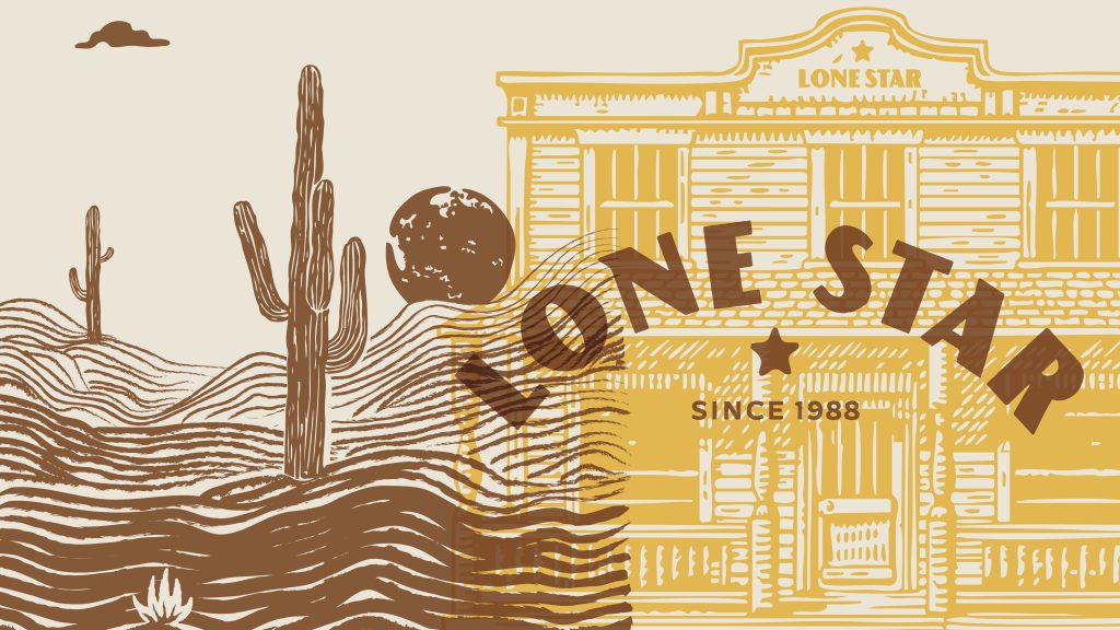
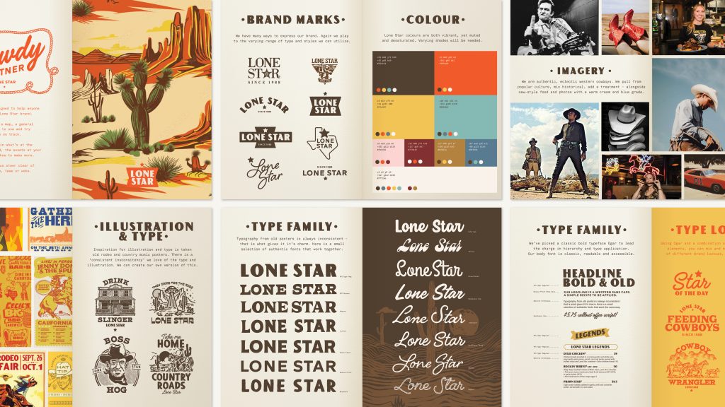
At the heart of the work was a guiding idea: ‘own the cowboy.’ This became more than just a tagline – it was a creative lens through which every design and communication choice was made. By celebrating the uniqueness of the cowboy and embracing its spirit, we were able to shape a tone of voice and visual identity that felt unmistakably Lone Star. The result was a much more authentic aesthetic, evoking the grit and charm of old rodeo posters, country music artwork, and vintage Americana.
Design System – Typography, Texture and Colour
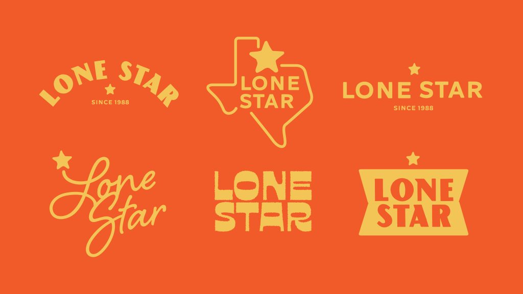
The brand system was built with a deliberately eclectic approach. We curated a collection of more than 20 approved typefaces, each selected for their character and charm. While on their own they were diverse and inconsistent, together they created a system that was unmistakably Lone Star — rough-around-the-edges yet consistent in overall feel. Textures, worn edges, and bold letterforms brought a handcrafted quality to every piece of collateral.
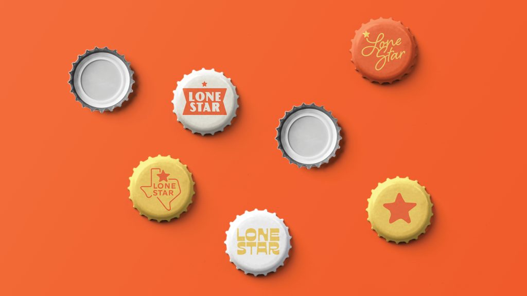
Colour became another cornerstone of the refresh. A palette of hazy yellows and burnt oranges was introduced, capturing the heat of the desert, the dust of the trail, and the warmth of a summer evening. These tones created an instantly recognisable backdrop for everything from menus to digital campaigns, balancing authenticity with visual punch.
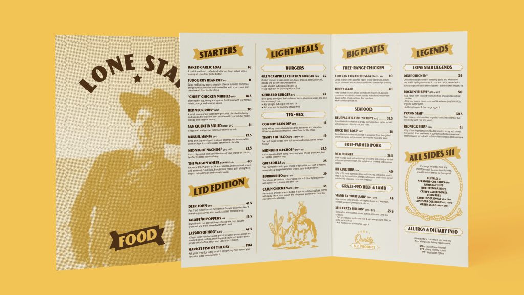
Menu Refresh – Simplifying the Experience
The brand refresh extended into the dining experience itself. A full redesign of Lone Star’s menus was undertaken, condensing six separate menus into just three. This streamlined not only the design process but also the customer journey, making the experience easier, clearer, and more enjoyable. Typography, colour, and layout were all carefully considered to align with the new brand direction, resulting in menus that felt both functional and true to the cowboy spirit.
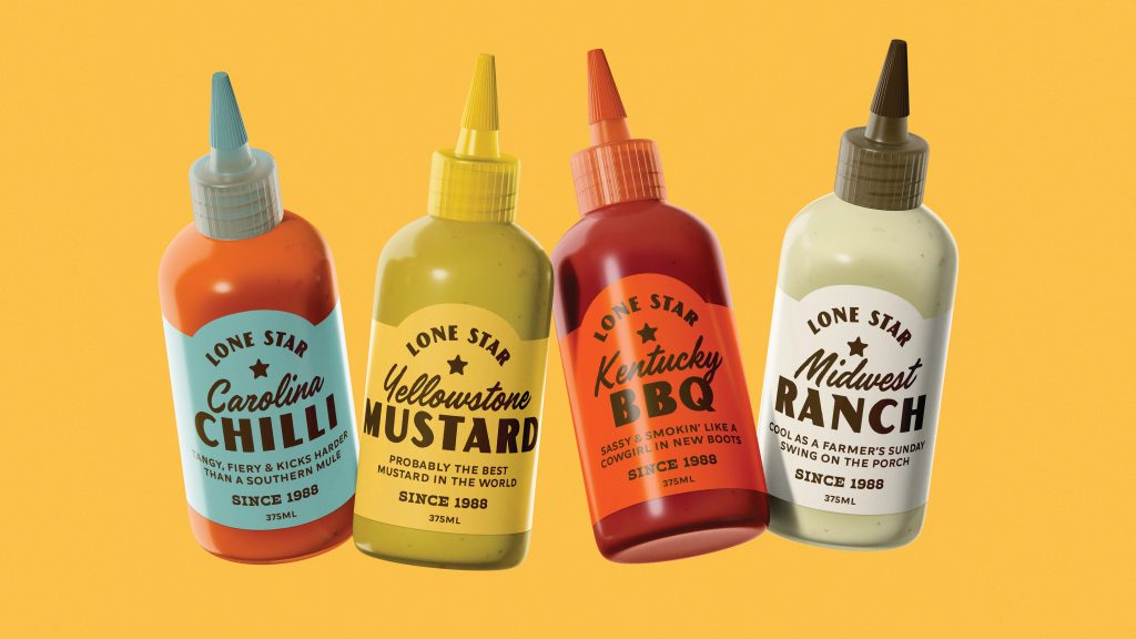
Lone Star Sauces
The famous Lone Star sauces were also given a redesign, elevating them from a functional product into a proud extension of the brand. The new look took a simplistic, stripped-back approach, allowing the sauces to feel both bold and iconic on shelf. Each flavour was colour-coded to reflect its unique taste profile — from fiery reds and deep browns through to smoky oranges and golden yellows – making them instantly recognisable at a glance. Strong, unapologetic typography anchored the design, echoing the cowboy aesthetic carried throughout the wider brand refresh. The result was packaging that not only communicated flavour quickly but also reinforced Lone Star’s personality, giving the sauces a collectible, almost merch-like quality.
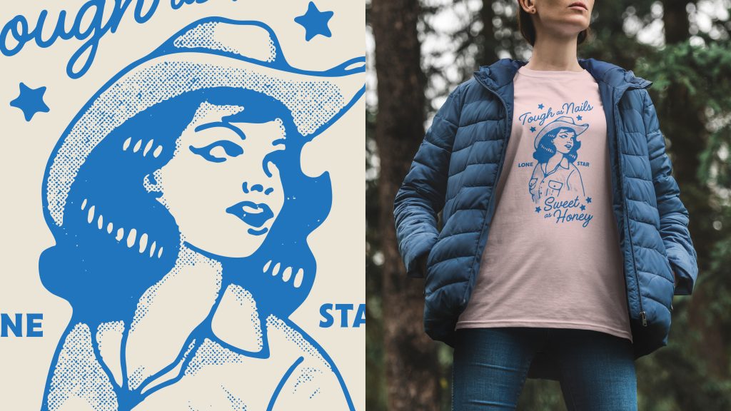
Illustration and Merchandise – Expanding the Visual World
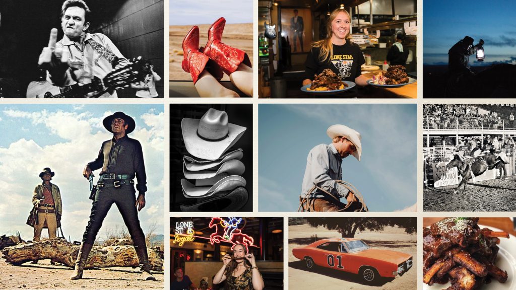
To enrich the visual language, we worked extensively with illustration. Starting with Adobe Stock, we customised imagery to align with the new aesthetic — adding texture, adjusting tones, and blending styles so they felt hand-picked and original. This illustration style, when paired with the typographic family, gave Lone Star a versatile toolkit for campaigns, in-restaurant collateral, and merchandise.
One standout application of this system was the creation of over 30 custom T-shirt prints. Each design drew from the cowboy theme while experimenting with the eclectic font set and illustration style. The result was a collection of wearable brand assets that staff, fans, and customers could proudly connect with.
Outcome
The repositioning breathed new life into Lone Star, reclaiming its cowboy heritage with confidence and consistency. By leaning into what made the brand distinctive and turning that into a system of fonts, colours, and illustrations, Lone Star emerged with a voice and visual identity that was both authentically rugged and creatively modern.
Brand Identity
Client – Lone Star Restaurants
Agency – AO Studios
Brand Strategy – Paul Courtney
Creative Director – Brent Courtney
Designer – Brent Courtney