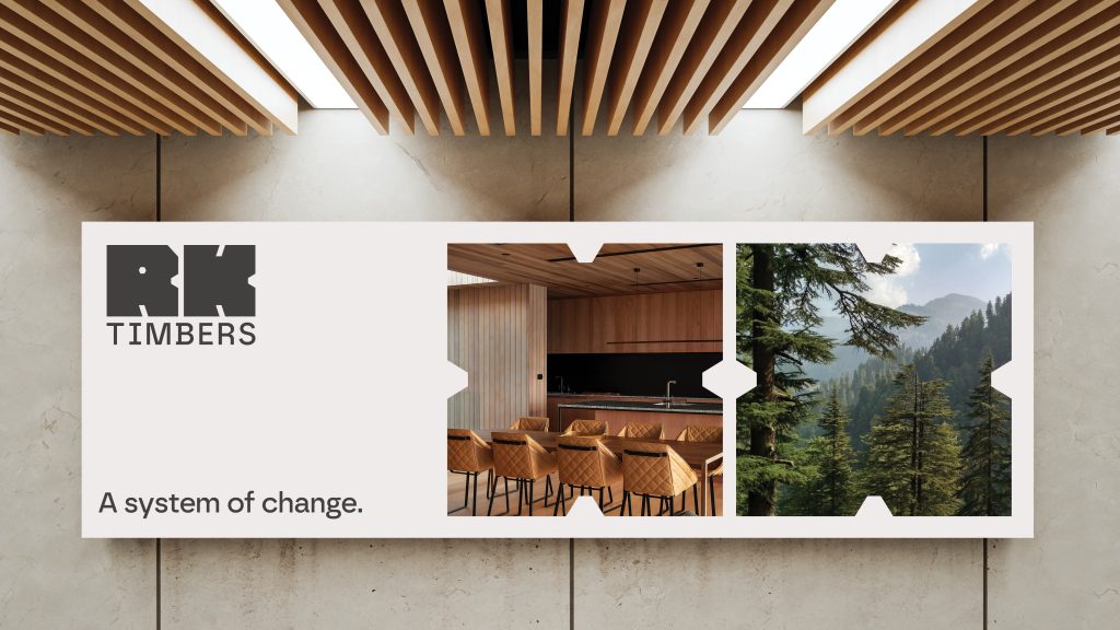
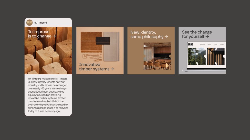
A brand keeping up with change.

Knowledge changes. Perspectives change. Tastes change. Regulations change.
The construction and timber industry is one of constant evolution. Every year, building codes are rewritten, customer expectations shift, and new technologies redefine what’s possible. Against this backdrop, RK Timbers wanted to position themselves not just as another supplier, but as an innovative partner leading the industry forward. Our role was to create a brand identity that expressed this strength of vision and commitment to sustainability, while remaining flexible enough to grow with them over time.
A clear point of view guided the work: the building industry is defined by change, and RK Timbers exists to provide solutions within this system of change. By embracing innovation, they are not simply responding to evolving needs, but setting new standards and leading the way for others to follow. The brand needed to speak with authority and modernity, but also with the grounded confidence of a company built on decades of experience in timber craftsmanship.
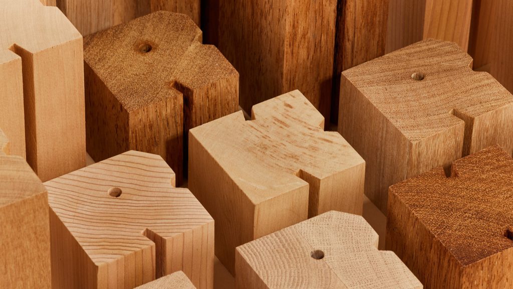
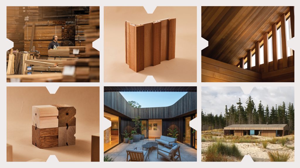
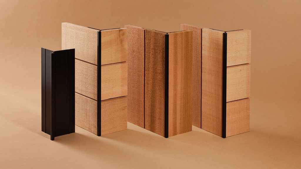
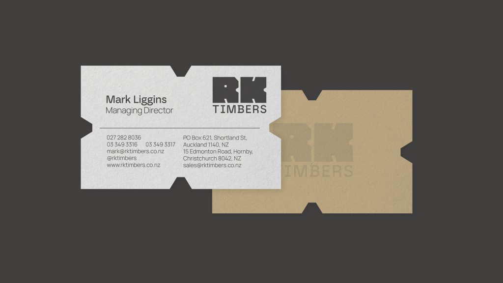
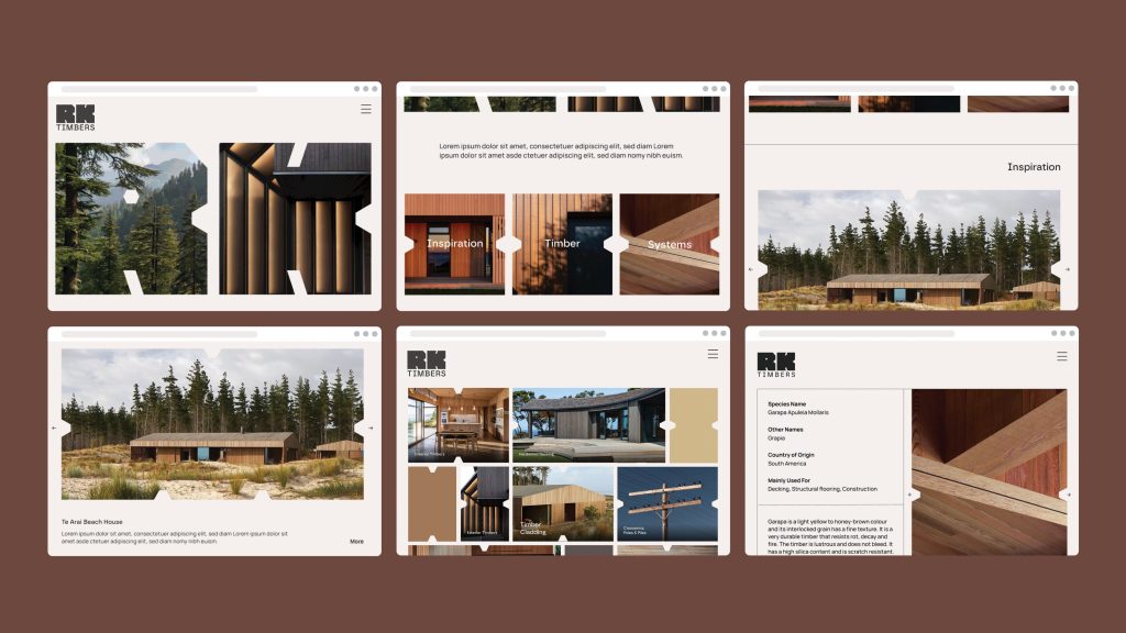
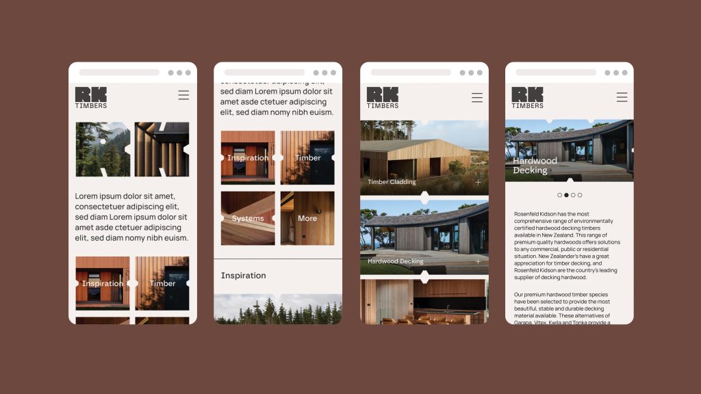
The core logo drew inspiration directly from RK Timbers’ own innovative timber cladding profiles. This wasn’t a symbol created in isolation—it was born from the product itself. By using the geometry of the profiles as a base, we developed a modular mark that could adapt and shift, much like the timber systems it represented. This approach provided a strong foundation for a wider design system, contemporary in look yet timeless in its structure, reinforcing the values of modularity, adaptability, and design innovation.
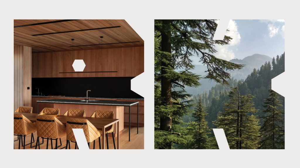
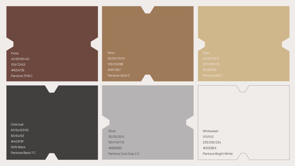
The colour palette was carefully considered to complement, rather than compete with, the natural beauty of timber. Warm woody tones and grounded earthy hues gave the brand a tactile, authentic quality. The palette allowed flexibility across both print and digital applications, ensuring harmony with the wood products in every setting—from sales collateral to large-scale signage.
The brand roll-out was comprehensive. We developed a full suite of stationery, sales brochures, and merchandise kits, all built around the modular system. The consistency across touchpoints helped solidify RK Timbers’ reputation for reliability and professionalism, while the design language provided enough variety to feel fresh and engaging.
To create memorable brand interactions, we designed and produced custom wooden artefacts of the logo itself. These tactile samples were intended to be left with clients as physical reminders of their valued relationship with RK Timbers. More than a simple leave-behind, they became symbolic of the company’s craftsmanship, innovation, and appreciation of its partners.
The launch was supported with high-quality still photography, video production, and a communications plan to bring the new brand to life. Over three months of curated social media content extended the impact, building awareness and telling the story of change, sustainability, and innovation. This not only created excitement at launch but established a longer-term platform for RK Timbers to communicate with confidence and consistency.
Through this work, RK Timbers gained more than a logo—they gained a cohesive brand system rooted in their own product innovation, a visual identity aligned with their values, and a communications toolkit capable of carrying them into the future.
Brand Identity
Client – RK Timbers
Agency – AO Studios
Brand Strategy – Paul Courtney and Brent Courtney
Creative Director – Brent Courtney
Designer – Brent Courtney
Photographer – Jamie Wright